Newton Medical Center
Project: To design a donor wall and related naming opportunity plaques for a just completed Heart Center.
Solution: Typical of our work we do not create different looks for each campaign. Once we have designed a brand identity for our client the design work follows naturally. We tailor each campaign's donor recognition to that specific campaign but follow the design guidelines already set in place.
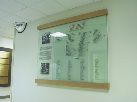
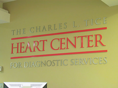
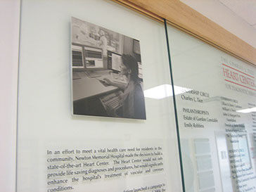
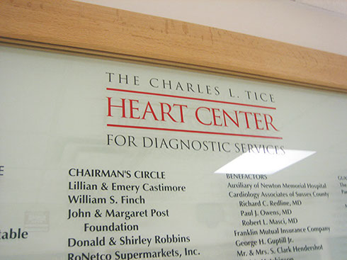
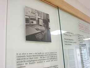
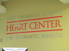
Since this was the second campaign for Newton Medical Center the donor wall style selected was one of our runners walls, just as we created for their tri-city capital campaign of several years earlier. The donor wall was built of two panels of glass one in front of the other. The back panel had a donor-centric case statement carved into the left side of the glass with two photo embedded metal plates of the new equipment above and below it. The front panel was all deep carved sand blasted glass featuring a bright red logo and hundreds of donor names. As you approach this wall you are taken by the fine detail of the sand blasting and the three-dimensional nature of the glass over glass installation. The wood runners tie everything together.
For the room naming opportunities we went back to Newton's standards again. We used the plaques designed from their first campaign and changed the logo. Instead of the tri-city logo these plaques had the Heart Center logo as their identifying mark. The look is effective in that whenever a plaque of a given size and format is seen it denotes donor support, no matter what the logo is. Making support easily identifiable to the public helps make the case of how well you are doing as an institution.


